site site-navbranch.xsl site

Looking for PowerPoint and/or Google Analytics solutions? Please follow the above links to ShufflePoint.com.
section no_callout.xsl no_callout
page screenshot_list.xsl b2005_11_25
The Third dimension - Trellis OWC charts with PAGE axis
Summary: In this article I will review the extension of xmla.wsf to handle trellis charting of the PAGE axis using the multi-chart capability of OWC ChartSpace.
Free doesn’t necessarily mean lousy. A case in point is Microsoft’s Office Web Controls ChartSpace control, an ActiveX control provided with Office which provides charting capabilities for applications and web pages. While not the sexiest charting control you can find, it does have several advantages, including:
- being free
- being well understood, well documented, widely used, etc.
- supports both a rich API and XML schema.
I’ve used ChartSpace is a couple of my previous articles - the best being “FLEXpart”. But FLEXpart was ASP-based and designed to run inside a framework (Sharepoint V1) which doesn’t exist any more. I’ve since built several iterations of FLEXpart for the new Sharepoint using .NET, but for exploratory work and rapid prototyping, I still prefer WSF. In this article I’ll be describing my extension to xmla.wsf to support charting.
ChartSpace quick review
In this article I am using the OWC11 version of ChartSpace. The CLASSID I use in my OBJECT tag is {0002E55D-0000-0000-C000-000000000046}. It is likely that my samples will work with OWC10 as well, but this being a free component (see resources for URL) I don’t see any reason not to use OWC11.
Microsoft is constantly changing their licensing rules for this component. It used to be non-redistributable. Then it was redistributable but only for non-iteractive use. Now it can supports a “shared interactive license” which basically means it can be shared between desktops within “business entities that own an Enterprise, Select, or Maintenance Agreement for Microsoft Office” as long as “there is explicit intent thru policy or otherwise to install a qualifying product at a later date.”
But in my work I always use the “Reduced Functionality Mode” of OWC. This is a better term than “non-iterative” because the reduced functionality mode does support interaction. What it doesn not support is runtime databinding. But whom in their right mind would use anything from MS called “data binding”. So in summary it is my expert (non)legal opinion that you are free to use my techniques in any Intranet or Internet application.
"Trellis"ing ChartSpace
ChartSpace supports a rich xml schema for defining charts. While not as well documented as it should be, you can find the schema online. And you can design your chart interactively and then export the XMLdata for use as a template. One of the little appreciated features of this schema is the support for trellised charts.
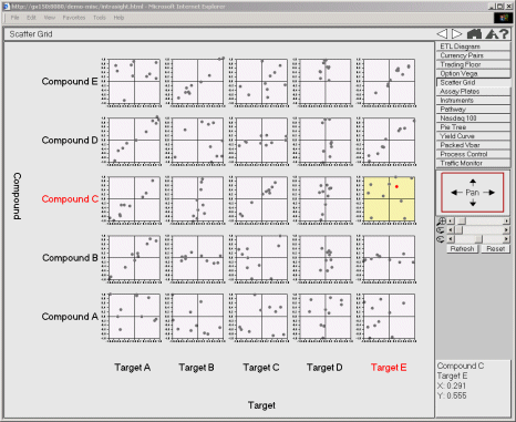
A trellis chart is simply the repetition of a chart across a grid, where each instance of the cart has one factor which changes (note: a 2D trellis can support two changing factors - see here for example). First discussed by Cleveland, it has long been promoted by the likes of Edward Tufte and Erik Thomsen to handle the display of higher-dimensionality data sets. Well, dimensionality can grow pretty darn quickly with SSAS, so this native trellacing capability should be of interest.
Most MDX users don’t have much experience with using the PAGES axis, the reason being that most client applications don’t support it. In the SQL 2005 Management Studio, if you run the following MDX:
SELECT
{[Sales Territory].[Sales Territory Country].[All Sales Territories].Children}
ON COLUMNS,
TOPCOUNT(
[Product].[Subcategory].MEMBERS,
5,
[Measures].[Reseller Sales Amount]
)
ON ROWS,
{[Date].[Calendar Year].[All Periods].Children}
ON PAGES
FROM [Sales Targets]
WHERE
{[Measures].[Reseller Sales Amount]}
you are greeted with the message:
Executing the query ...
Obtained object of type: Microsoft.AnalysisServices.AdomdClient.CellSet
Formatting.
Results cannot be displayed for cellsets with more than two axes.
Execution complete
To escape this “flat land” of MDX we need to “think outside the plane” (when I get to visualizing four or five dimensional data I be able to say “think outside the box”).
My approach was to exploit the trellising in OWC by extending my “tabular intermediate format” XML (TIFXML for now) which I’ve used in my other articles with an outer <charts> tag. An example of a TIFXML document can be seen here. This document was created by transforming the XMLA Execute resultset of the above MDX using an XSLT which embeds the TIFXML as a data island in an HTML document. An XSLT data island is used to transform the TIFXML into ChartSpace XML.
Why the two step XSLT pipeline? For one XMLA and ChartSpaceXML were just too far apart. So the best modular solution was a pipeline. But just as important a reason is that I can do other things with TIFXML - and do them more easily than working with the multi-dimensional XMLA format. Since the TIFXML is persisted as XML on the client-side, I can, for instance, allow the user to interact with the charts without requiring a trip back to the server.
PreChart-Trellis.xsl
But first, allow me to further explain the file prechart-trellis.xsl, which really orchestrates the connection of xmla.wsf and OWC. At the heart of hearts is the line
ChartSpace1.XMLData = xmlDataIsland.transformNode(xslDataIsland);
which applies a client-side XSL to the client-side TIFXML to generate ChartSpace XML and feed it into the XMLData property of the control. If that seems too easy, it is because all of the complexity is inside chartspace.xsl, which is responsible for generated trellis and non-trellis charts of the various flavors supported by OWC. The TIFXML has as children of the root node the elements <type> and <subtype>. These properties tell ChartSpace how to chart (line, bar, etc.). xmla.wsf puts these values as xsl:param’s into prechart-trellis.xsl by splitting the /g command-line argument, which is given as Type.Subtype, for example from chart-aw.cmd:
cscript //nologo xmla.wsf /url:"http://localhost/olap/msmdpump.dll" /c:"Adventure Works DW" /e:xml/aw-chart8.xml /g:Column.Stacked /out:"html/chart.html" /v
In this case, the /g:Column.Stacked results in
<? xml version ="1.0" encoding ="utf-8"?>
< charts >
< title >Reseller Sales Amount by Product Subcategory</ title >
< type >Column</ type >
< subtype >Stacked</ subtype >
< chart >
< title >CY 2001</ title >
found at the top of charts.html
The meat (XSLT-wise) of prechart-trellis.xsl are the three templates which process the XMLA. In order, they are the templates which process the Pages axis (axis2), the Rows axis (axis1), and the Columns (axis0) axis. Those of you familiar with Microsoft’s provided xamd.xsl sample will see some shared patterns. I am not going to explain these transforms in detail here - you should study and play with them to gain a better understanding of XSLT and XMLA.
Well I’m sure by now you are saying “enough talk for crying out loud - show me some graphs!”. So as not to disappoint (and reward you for sticking with me), here are a few graphs, along with the MDX used to build them. Also, you will find a link to the live document (you will need to have OWC11 installed in order to view it)
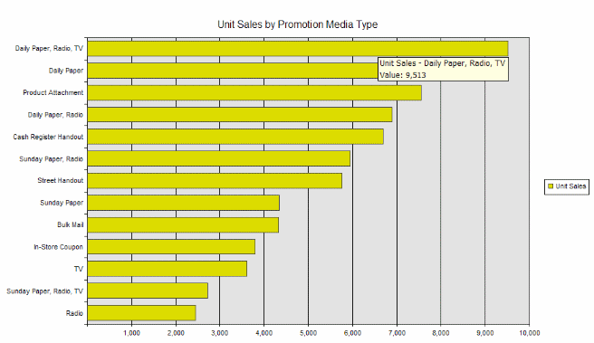
1. Unit Sales by Promition Media Type
Simple bar graph - make sure things are working.
MDX
WITH
	MEMBER Measures.[$Unit Sales]
		AS 'Measures.[Unit Sales]', FORMAT_STRING = '#,#'
SELECT
	{
	[Measures].[$Unit Sales]
	}
	ON COLUMNS,
	ORDER(
		EXCEPT(
			[Promotion Media].[Media Type].MEMBERS,
			{[Promotion Media].[Media Type].[No Media]}
		),
		[Measures].[$Unit Sales],
		DESC
	)
	ON ROWS
FROM [Sales]
Resulting display
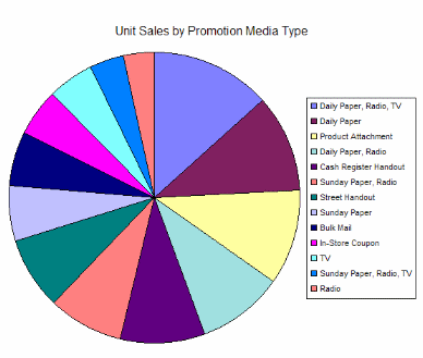
2. Unit Sales by Promition Media Type
Same simple query displayed as pie chart.
MDX
Resulting display
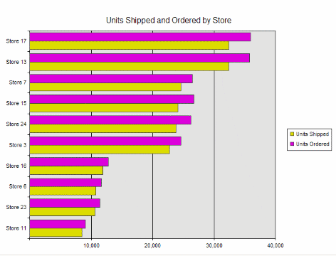
3. Units Shipped and Ordered by Store
Displays two measures on column axis.
MDX
SELECT
{
	[Measures].[Units Shipped],
	[Measures].[Units Ordered]
}
ON COLUMNS,
TOPCOUNT(
	[Store].[Store Name].MEMBERS,
	10,
	[Measures].[Units Shipped]
)
ON ROWS
FROM [Warehouse]
Resulting display
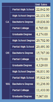
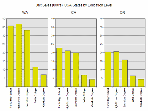
4. Unit Sales by State and Education
The simplest crossjoin case - displayed in typical grid fashion.
MDX
Select
  Order(
    {
      [Measures].[MeasuresLevel].[Unit Sales]
    },
    [Measures].[MeasuresLevel].[Unit Sales],
    DESC
  )
  On Columns,
  Order(
    {
       CrossJoin(
         {
           [Customers].[Country].[USA].Children
         },
         {
           [Education Level].[Education Level].Members
         }
        )
      },
      [Measures].[MeasuresLevel].[Unit Sales],
      DESC
    )
  On Rows
From [sales]
Resulting display
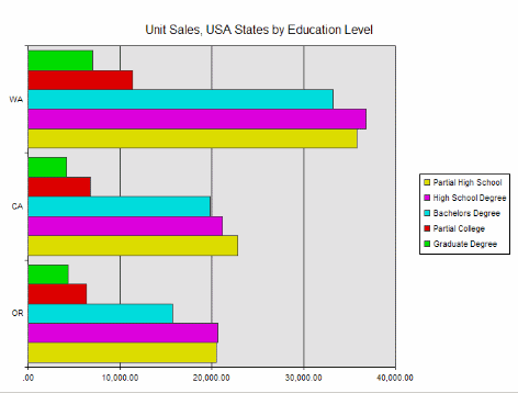
5. Unit Sales by State and Education
Previous query has been restructured to move measure to where clause so that each dimension can have its own axis - which makes rendering template display as clustered bars.
MDX
Select
  Order(
    { [Education Level].[Education Level].Members },
    [Measures].[MeasuresLevel].[Unit Sales],
    DESC
  )
    On Columns,
  Order(
    { [Customers].[Country].[USA].Children },
    [Measures].[MeasuresLevel].[Unit Sales],
    DESC
  )
    On Rows
From
  [sales]
Where
  [Measures].[MeasuresLevel].[Unit Sales]
Resulting display
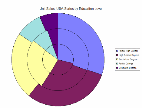
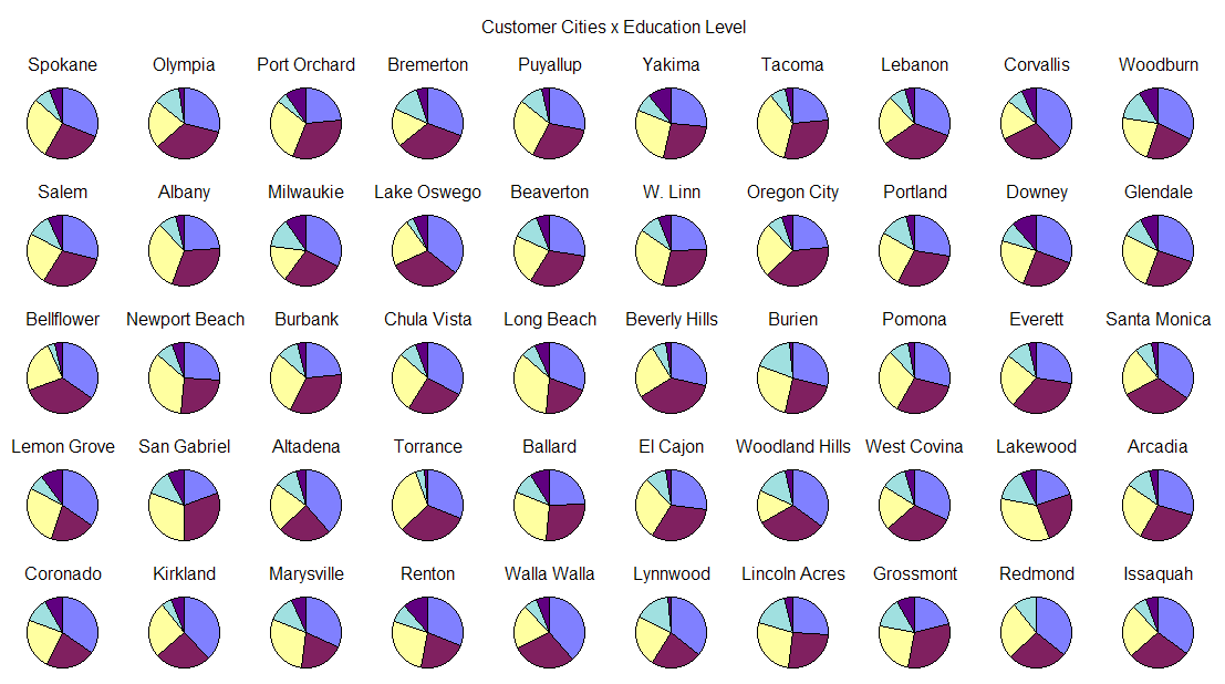
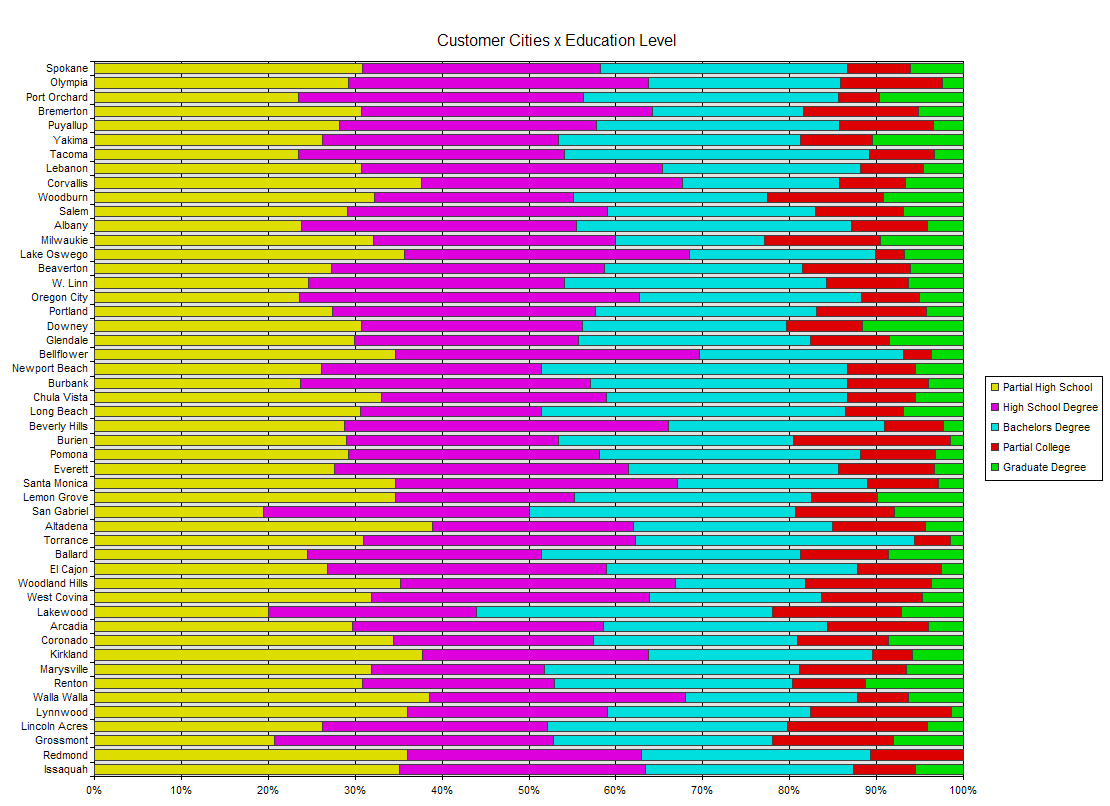
6. Unit Sales by Education and State
Same query but dimension are swapped to make it present properly as stacked pie. The second dimension, now Education, is for the slices of the pie. These 5 members add up to 100%, it makes sense to slice the pie by Education.
MDX
Select
  Order(
    { [Customers].[Country].[USA].Children },
    [Measures].[MeasuresLevel].[Unit Sales],
    DESC
  )
    On Columns,
  Order(
    { [Education Level].[Education Level].Members },
    [Measures].[MeasuresLevel].[Unit Sales],
    DESC
  )
    On Rows
From
  [sales]
Where
  [Measures].[MeasuresLevel].[Unit Sales]
Resulting display
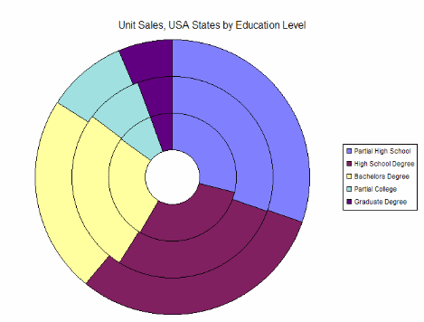
7. As Doughnut
In fm7, the same query is displayed with the Doughnut chart, which is the same as a stacked pie except it leaves a hole.
MDX
Resulting display
8. The third dimension
What you’ve been waiting for. A third dimension introduced in the Pages axis. The chart rendering template puts each page tuple in a separate graph.
MDX
With
	Member Measures.[$Unit Sales]
		AS 'Measures.[Unit Sales]  / 1000', FORMAT_STRING = '#,#'
Select
  [Measures].[MeasuresLevel].[$Unit Sales]
    On Columns,
  Order(
    { [Education Level].[Education Level].Members },
    [Measures].[MeasuresLevel].[Unit Sales],
    DESC
  )
    On Rows,
  Order(
    { [Customers].[Country].[USA].Children },
    [Measures].[MeasuresLevel].[Unit Sales],
    DESC
  )
    On Pages
From
  [sales]
Resulting display
9. Cities Level
Query is changed to use Cities level, which results in a higher cardinality trellace. But it also shows that column charts are not well suited for displaying long captions.
MDX
With
	Member Measures.[$Unit Sales]
		AS 'Measures.[Unit Sales]  / 1000', FORMAT_STRING = '#,#'
	SET [Dicer Filtered Set]
      AS '{Descendants ([Customers].[All Customers], [Customers].[City],SELF)}'
Select
  [Measures].[MeasuresLevel].[$Unit Sales]
  On Columns,
  Order(
    { [Education Level].[Education Level].Members },
    [$Unit Sales],
    DESC
  )
  On Rows,
  Non Empty
  {
	Head (
		Order ([Dicer Filtered Set],
			[$Unit Sales],
			BDESC
		),
		10
	)
  }
  On Pages
From
  [sales]
Resulting display
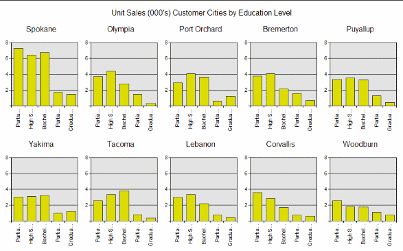
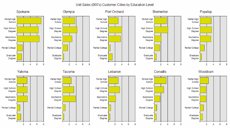
10. Bars are better
Changing chart type to Bar results in the whole caption being shown.
MDX
Resulting display
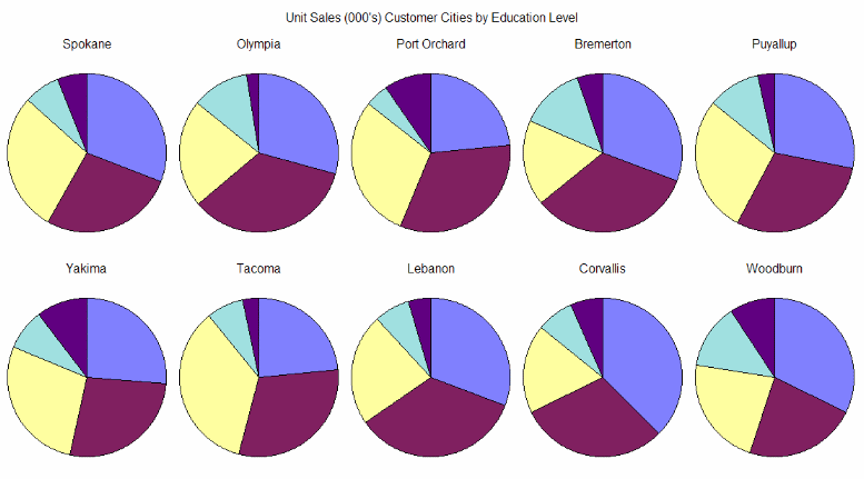
11. Try as pie trellis
Same query displayed as a pie trellis. I think this looks pretty cool. But in a real program there would be a "show legend" button.
MDX
Resulting display
12. More pies!
Drop level down to City and get top 50. This trellis chart would best supplement one which showed sales for each city.
MDX
With
	Member Measures.[$Unit Sales]
		AS 'Measures.[Unit Sales]  / 1000', FORMAT_STRING = '#,#'
	Set [Dicer Filtered Set]
      As '{Descendants ([Customers].[All Customers], [Customers].[City],SELF)}'
Select
  Order(
    {
      [Measures].[MeasuresLevel].[$Unit Sales]
    },
    [$Unit Sales],
    DESC
  )
  On Columns,
  Order(
    { [Education Level].[Education Level].Members },
    [$Unit Sales],
    DESC
  )
  On Rows,
  Non Empty
  {
	Head (
		Order ([Dicer Filtered Set],
			[$Unit Sales],
			BDESC
		),
		50
	)
  }
  On Pages
From [sales]
Resulting display
13. A pie replacement
I often use 100% bar charts instead of a pie trellis for this type of data. It gives a different visual perspective. Ok, now onto some Adventure Works queries and displays.
MDX
With
	Set [Dicer Filtered Set]
      As '{Descendants ([Customers].[All Customers], [Customers].[City],SELF)}'
Select
  Order(
    { [Education Level].[Education Level].Members },
    [Measures].[Unit Sales],
    DESC
  )
  On Columns,
  Non Empty
  {
    TopCount ([Dicer Filtered Set], 50,[Measures].[Unit Sales])
  }
  On Rows
From
   [sales]
Where
  [Measures].[Unit Sales]
Resulting display
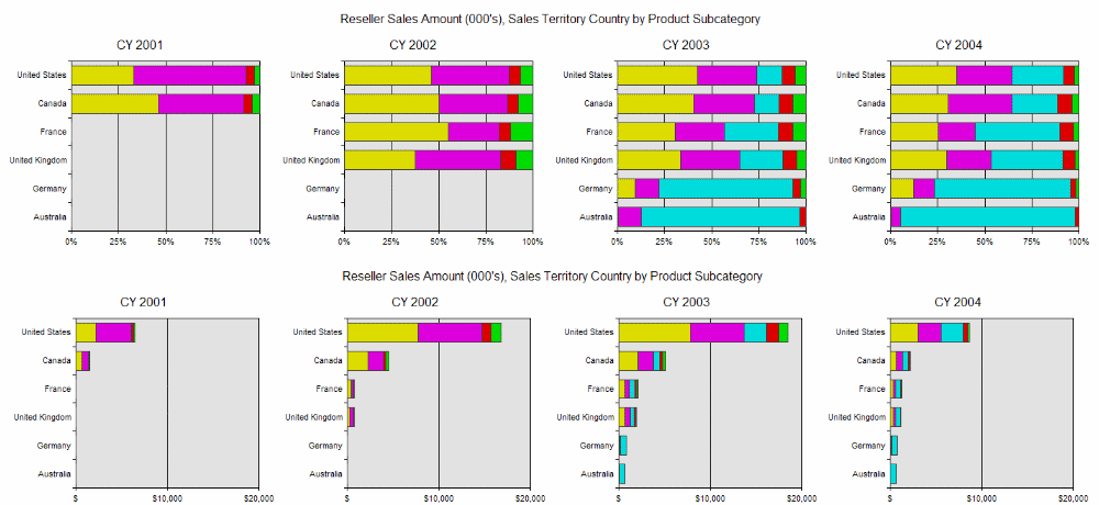
14. Reseller Sales Amount, Sales Territory Country by Product Subcategory
The query has Date on the Pages axis to make it a trellis. The top chart is 100% bars - the bottom is value bars. I think both points of view are valuable.
MDX
WITH
  MEMBER [Measures].[$RSA]
    AS '[Measures].[Reseller Sales Amount]  / 1000', FORMAT_STRING = '$#,#'
	SET Top5Products AS
		'TOPCOUNT([Product].[Subcategory].[All Products].Children,5,[Measures].[Reseller Sales Amount])'
SELECT
  Top5Products
  ON COLUMNS,
  Non Empty
  Order(
    {
      [Sales Territory].[Sales Territory Country].[All Sales Territories].Children
    },
    [Measures].[Reseller Sales Amount],
    DESC
  )
  ON ROWS,
  {
    [Date].[Calendar Year].[All Periods].Children
  }
    ON PAGES
FROM
  [Sales Targets]
WHERE
  {
    [Measures].[$RSA]
  }
Resulting display
15. Columns and Rows axes swapped
When these axes are swapped, it changes which dimension is used as the chart series. Still trellised by date.
MDX
WITH
  MEMBER [Measures].[$RSA]
    AS '[Measures].[Reseller Sales Amount]  / 1000', FORMAT_STRING = '$#,#'
SELECT
  NON EMPTY
  Order(
    {
      [Sales Territory].[Sales Territory Country].[All Sales Territories].Children
    },
    [Measures].[Reseller Sales Amount],
    DESC
  )
    ON COLUMNS,
  TOPCOUNT (
    [Product].[Subcategory].[All Products].Children,
    5,
    [Measures].[Reseller Sales Amount]
  )
     ON ROWS,
  {
    [Date].[Calendar Year].[All Periods].Children
  }
    ON PAGES
FROM
  [Sales Targets]
WHERE
  {
    [Measures].[$RSA]
  }
Resulting display
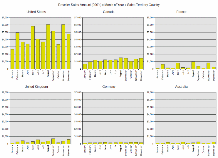
16. Reseller Sales Amount x Month of Year x Sales Territory Country
Pages axis in this query makes it trellis by Country. An interesting observation is the pattern of reseller sales found in the US and in France compared to the pattern observed in the other countries. I’d try to understand that.
MDX
WITH
  MEMBER [Measures].[$RSA]
    AS '[Measures].[Reseller Sales Amount]  / 1000', FORMAT_STRING = '$#,##0'
SELECT
  {
    [Measures].[$RSA]
  }
    ON COLUMNS,
  {
    [Date].[Month of Year].[All Periods].Children
  }
    ON ROWS,
  NON EMPTY
  ORDER (
    {
      [Sales Territory].[Sales Territory Country].[All Sales Territories].Children
    },
    [Measures].[Reseller Sales Amount],
    DESC
  )
    ON PAGES
FROM
  [Sales Targets]
Resulting display
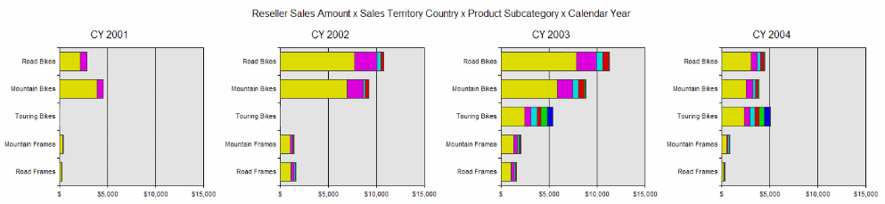
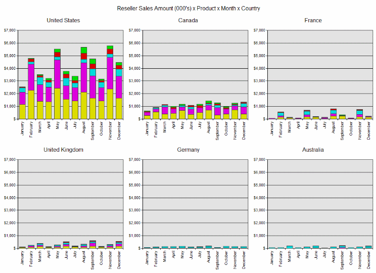
17. Reseller Sales Amount x Product x Month x Country
By moving the measure to the where clause, I can have three dimensions represented. Product category replaces Measure as the inner-most charting dimension. So each of the bars in the previous result is now sliced by product category.
MDX
WITH
  MEMBER [Measures].[$RSA]
     AS '[Measures].[Reseller Sales Amount]  / 1000', FORMAT_STRING = '$#,##0'
  SET Top5Products AS
	  'TOPCOUNT([Product].[Subcategory].[All Products].Children,5,[Measures].[Reseller Sales Amount])'
SELECT
  Top5Products
    ON COLUMNS,
  {
    [Date].[Month of Year].[All Periods].Children
  }
    ON ROWS,
  NON EMPTY
  ORDER (
    {
      [Sales Territory].[Sales Territory Country].[All Sales Territories].Children
    },
    [Measures].[Reseller Sales Amount],
    DESC
  )
    ON PAGES
FROM
  [Sales Targets]
WHERE
   [Measures].[$RSA]
Resulting display
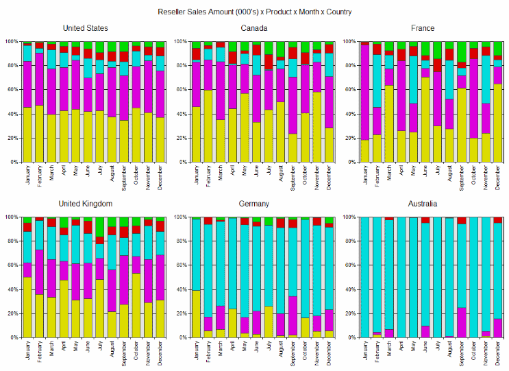
18. Same query displayed as 100% columns.
Again a nice way to show the relative sales breakdown by product category.
MDX
Resulting display
Summary
One change I’ll probably make is to allow the chart type and subtype to be defined in the query XML file. Having a good default chart display associated with the query makes sense to me - perhaps the xmla.wsf setting could override it.
Resources
- OWC11 Download
- http://www.microsoft.com/downloads/details.aspx?familyid=7287252C-402E-4F72-97A5-E0FD290D4B76&displaylang=en
- Office Web Component (O.W.C.) interactive usage
- http://support.microsoft.com/?scid=kb;en-us;555094&spid=2488&sid=225
- Trellis Display: What, Why, Who, When
- http://netlib.bell-labs.com/cm/ms/departments/sia/project/trellis/wwww.html
- ChartSpace object model
- http://msdn.microsoft.com/library/default.asp?url=/library/en-us/owcvba10/html/octocChartWorkspaceObjectModel.asp?frame=true
References
Becker, R. A., Cleveland, W. S., & Shyu, M. J. (1996). The visual design and control of Trellis Display. Journal of Computational and Statistical Graphics, 5, 123-155.
Thomsen, Erik. OLAP Solutions, John Wiley & Sons, Inc., New York, NY, 1997.
Tufte, Edward R. The Visual Display of Quantitative Information, Graphics Press, Cheshire, CT, 1983.